
What to Do If Your Website Feels Outdated After Updates
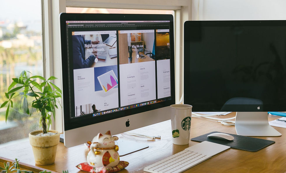
It’s a strange feeling when you just updated your website, but something still feels off. You might scroll through the pages, expecting a fresher look, but instead it seems like nothing really changed. That’s more common than you’d think. Small updates can actually make a site feel more disconnected if they don’t match the rest of your design or voice. Sometimes the new pieces don’t quite blend with what’s already there. That’s when the question starts creeping in, did something go wrong, or was the update just not enough? A trusted website design company can usually help sort that out. Let’s take a look at what might be making the site feel outdated and what to do next.
Recognize What Actually Feels Off
The word "outdated" means different things to different people. For some, it's the colors or layout. For others, it might be how slow a mobile version feels or how hard it is to find the menu. Right now, design trends shift fast, especially heading into mid-summer when businesses freshen things up before the back-to-school season.
What looked modern last year may now feel bulky, complicated, or just kind of plain. A lot of new websites today are shifting to softer motion, bigger images, and cleaner colors. If your updates didn’t touch those things, the site might still feel like it’s lagging behind. Before rushing into another overhaul, try narrowing down what part of the site is falling short of expectations.
Check for Hidden Clashes with Old Content
Mixing old and new elements can create a blend that doesn’t quite sit right. Picture a brand-new header on a page filled with years-old graphics or outdated fonts. It doesn’t take much for that kind of mismatch to throw off the feel of the entire site.
Here’s what helps when looking for issues like that:
Start with the home, about, and contact pages. These areas usually get seen the most.
Notice changes in color, font, or spacing that don’t match surrounding sections.
Scan for older branding, such as logos or stock photos, that may need replacing.
Sometimes it’s not the update that caused the problem, but the old content still hanging on underneath it.
Focus on How Visitors Really Use the Site
A fresh-looking site isn’t enough if it’s hard to use. This is especially true during summer, when people are out and about, often checking things on their phones. If your site doesn’t feel smooth and simple on mobile, it can instantly feel outdated, even if it was updated last week.
Our advice stays pretty grounded in what customers tend to care about:
Is the menu easy to tap on a small screen?
Do pages load fast and stay easy to read outdoors?
Does the homepage make it obvious where to go next?
Tiny blocks of text, hard-to-see buttons, or tangled navigation paths make visitors give up quickly. Keeping that experience clean, quick, and clear makes a bigger difference than most layout improvements.
When It’s Time to Hit Refresh
There’s a point when patching in new updates just doesn’t help anymore. If you’ve cleaned things up, adjusted page designs, and updated branding but it still doesn’t feel right, starting fresh might be the better option.
Some signs include:
Menus that feel too cluttered or confusing
Images that no longer match your brand’s look or message
Layouts that look cramped or boxed in on newer screens
A good website design company can step in and help realign everything. Clean layouts, better flow, and sharper visuals often make things feel new without having to change everything from scratch.
Keep Your Summer Site Feeling Like You
Sometimes a site feels off because your brand has grown or changed, and your updates didn’t keep up. Summer is a great time to think about what energy your business is putting out. Has your tone shifted to be more casual, more confident, more friendly?
Design choices should reflect those changes. That might mean:
Lighter, brighter colors that match warm-weather vibes
Fonts that feel more fun or less formal
Photos that look like your actual community or audience
The more your site reflects your current energy, the more natural it’ll feel to you and your visitors.
Bring Back That Confident Click-Through
If your updates didn’t land the way you thought they would, that doesn’t mean you made a bad call. It’s just a signal that the updates might not be telling the full story. A small refresh or a clearer layout could be all it takes to feel current again.
This is a good moment to stop and think about how you want people to feel when they land on your website. Comfortable? Curious? Trusting? You can shape that without overhauling everything, just by making small, meaningful changes that carry your message clearly. Fall campaigns aren’t far off, which makes early July the perfect time to fine-tune and get ready for what’s ahead.
Before you conclude your review, take a moment to evaluate every section of your website. Walk through each page as if you were a first-time visitor and consider the overall coherence of design, navigation, and content. This reflective step helps ensure that every update aligns with your brand’s identity and meets user expectations. Remember, a thoughtful and thorough evaluation can lead to significant improvements in overall performance.
Even after updates, your site might not deliver the results you need. Stepping back to evaluate its structure often reveals hidden issues or opportunities for improvement. When you want clear, consistent changes that truly help your business grow, partnering with a trusted website design company can make all the difference. At Midnight Design and Promos, we’re ready to help you move forward confidently, reach out today and let’s get started.
Still have questions or need personalized advice? Schedule a free consultation with our Creative Director, Kristin Kodenski.
Take the first step towards transforming your brand’s visual identity today. Let’s create something remarkable together!


Comments